Button
Examples#
Basic Example#
import flet as ft
def main(page: ft.Page):
page.title = "Button Example"
page.add(
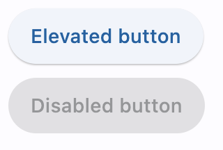
ft.Button(content="Elevated button"),
ft.Button(content="Disabled button", disabled=True),
)
ft.run(main)
Icons#
import flet as ft
def main(page: ft.Page):
page.title = "Button Example"
page.add(
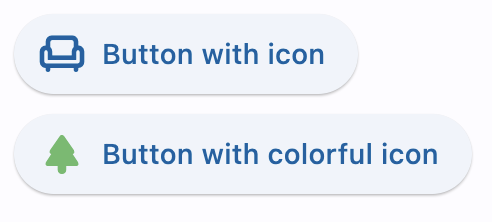
ft.Button(content="Button with icon", icon=ft.Icons.WAVES_ROUNDED),
ft.Button(
content="Button with colorful icon",
icon=ft.Icons.PARK_ROUNDED,
icon_color=ft.Colors.GREEN_400,
),
)
ft.run(main)
Handling clicks#
import flet as ft
def main(page: ft.Page):
page.title = "Button Example"
page.theme_mode = ft.ThemeMode.LIGHT
def button_clicked(e: ft.Event[ft.Button]):
button.data += 1
message.value = f"Button clicked {button.data} time(s)"
page.update()
page.add(
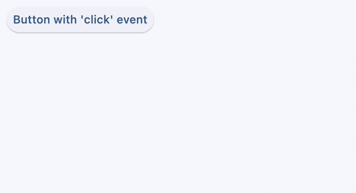
button := ft.Button(
content="Button with 'click' event",
data=0,
on_click=button_clicked,
),
message := ft.Text(),
)
ft.run(main)
Custom content#
import flet as ft
def main(page: ft.Page):
page.title = "Button Example"
page.add(
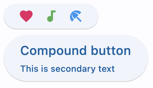
ft.Button(
width=150,
content=ft.Row(
alignment=ft.MainAxisAlignment.SPACE_AROUND,
controls=[
ft.Icon(ft.Icons.FAVORITE, color=ft.Colors.PINK),
ft.Icon(ft.Icons.AUDIOTRACK, color=ft.Colors.GREEN),
ft.Icon(ft.Icons.BEACH_ACCESS, color=ft.Colors.BLUE),
],
),
),
ft.Button(
content=ft.Container(
padding=ft.Padding.all(10),
content=ft.Column(
alignment=ft.MainAxisAlignment.CENTER,
spacing=5,
controls=[
ft.Text(value="Compound button", size=20),
ft.Text(value="This is secondary text"),
],
),
),
),
)
ft.run(main)
Shapes#
Styling#
import flet as ft


def main(page: ft.Page):
    page.padding = 50
    page.theme_mode = ft.ThemeMode.LIGHT

    page.add(
        ft.Button(
            content="Styled button 1",
            style=ft.ButtonStyle(
                color={
                    ft.ControlState.HOVERED: ft.Colors.WHITE,
                    ft.ControlState.FOCUSED: ft.Colors.BLUE,
                    ft.ControlState.DEFAULT: ft.Colors.BLACK,
                },
                bgcolor={
                    ft.ControlState.FOCUSED: ft.Colors.PINK_200,
                    ft.ControlState.DEFAULT: ft.Colors.YELLOW,
                },
                padding={ft.ControlState.HOVERED: 20},
                overlay_color=ft.Colors.TRANSPARENT,
                elevation={
                    ft.ControlState.DEFAULT: 0,
                    ft.ControlState.HOVERED: 5,
                    ft.ControlState.PRESSED: 10,
                },
                animation_duration=500,
                side={
                    ft.ControlState.DEFAULT: ft.BorderSide(1, color=ft.Colors.BLUE_100),
                    ft.ControlState.HOVERED: ft.BorderSide(3, color=ft.Colors.BLUE_400),
                    ft.ControlState.PRESSED: ft.BorderSide(6, color=ft.Colors.BLUE_600),
                },
                shape={
                    ft.ControlState.HOVERED: ft.RoundedRectangleBorder(radius=20),
                    ft.ControlState.DEFAULT: ft.RoundedRectangleBorder(radius=2),
                },
            ),
        )
    )


ft.run(main)
Animate on hover#
import flet as ft


def main(page: ft.Page):
    def animate(e: ft.Event[ft.Button]):
        e.control.rotate = 0.1 if e.data else 0
        page.update()

    page.add(
        ft.Button(
            content="Hover over me, I'm animated!",
            rotate=0,
            animate_rotation=100,
            on_hover=animate,
            on_click=lambda e: page.add(ft.Text("Clicked! Try a long press!")),
            on_long_press=lambda e: page.add(ft.Text("I knew you could do it!")),
        )
    )


ft.run(main)
Bases: LayoutControl, AdaptiveControl
A customizable button control that can display text, icons, or both.
It supports various styles, colors, and event handlers for user interaction.
adaptive: bool | None = None
Enables platform-specific rendering or inheritance of adaptiveness from parent controls.
animate_align: AnimationValue | None = None
Enables implicit animation of the [align][flet.LayoutControl.] property.
More information here.
animate_margin: AnimationValue | None = None
Enables implicit animation of the [margin][flet.LayoutControl.] property.
More information here.
animate_offset: AnimationValue | None = None
Enables implicit animation of the [offset][flet.LayoutControl.] property.
More information here.
animate_opacity: AnimationValue | None = None
Enables implicit animation of the [opacity][flet.LayoutControl.] property.
More information here.
animate_position: AnimationValue | None = None
Enables implicit animation of the positioning properties
([left][flet.LayoutControl.], [right][flet.LayoutControl.],
[top][flet.LayoutControl.] and [bottom][flet.LayoutControl.]).
More information here.
animate_rotation: AnimationValue | None = None
Enables implicit animation of the [rotate][flet.LayoutControl.] property.
More information here.
animate_scale: AnimationValue | None = None
Enables implicit animation of the [scale][flet.LayoutControl.] property.
More information here.
aspect_ratio: Number | None = None
The aspect ratio of the control. It is defined as the ratio of the width to the height.
bottom: Number | None = None
The distance that the child's bottom edge is inset from the bottom of the stack.
Note
Effective only if this control is a descendant of one of the following:
[Stack][flet.] control, [Page.overlay][flet.] list.
col: ResponsiveNumber = 12
If a parent of this control is a [ResponsiveRow][flet.],
this property is used to determine
how many virtual columns of a screen this control will span.
Can be a number or a dictionary configured to have a different value for specific
breakpoints, for example col={"sm": 6}.
This control spans the 12 virtual columns by default.
Dimensions
| Breakpoint | Dimension |
|---|---|
| xs | <576px |
| sm | ≥576px |
| md | ≥768px |
| lg | ≥992px |
| xl | ≥1200px |
| xxl | ≥1400px |
disabled: bool = False
Every control has disabled property which is False by default - control and all
its children are enabled.
Note
The value of this property will be propagated down to all children controls recursively.
Specifies whether/how this control should expand to fill available space in its parent layout.
More information here.
Note
Has effect only if the direct parent of this control is one of the following
controls, or their subclasses: [Column][flet.], [Row][flet.],
[View][flet.], [Page][flet.].
expand_loose: bool = False
Allows the control to expand along the main axis if space is available, but does not require it to fill all available space.
More information here.
Note
If expand_loose is True, it will have effect only if:
expandis notNoneand- the direct parent of this control is one of the following controls, or their
subclasses: [
Column][flet.], [Row][flet.], [View][flet.], [Page][flet.].
left: Number | None = None
The distance that the child's left edge is inset from the left of the stack.
Note
Effective only if this control is a descendant of one of the following:
[Stack][flet.] control, [Page.overlay][flet.] list.
offset: OffsetValue | None = None
Applies a translation transformation before painting the control.
The translation is expressed as an Offset scaled to the control's size.
So, Offset(x=0.25, y=0), for example, will result in a horizontal translation
of one quarter the width of this control.
Example
The following example displays container at 0, 0 top left corner of a stack as
transform applies -1 * 100, -1 * 100 (offset * control's size) horizontal and
vertical translations to the control:
on_animation_end: (
    ControlEventHandler[LayoutControl] | None
) = None
Called when animation completes.
Can be used to chain multiple animations.
The data property of the event handler argument contains the name
of the animation.
More information here.
opacity: Number = 1.0
Defines the transparency of the control.
Value ranges from 0.0 (completely transparent) to 1.0 (completely opaque
without any transparency).
parent: BaseControl | None
The direct ancestor(parent) of this control.
It defaults to None and will only have a value when this control is mounted
(added to the page tree).
The Page control (which is the root of the tree) is an exception - it always
has parent=None.
right: Number | None = None
The distance that the child's right edge is inset from the right of the stack.
Note
Effective only if this control is a descendant of one of the following:
[Stack][flet.] control, [Page.overlay][flet.] list.
rotate: RotateValue | None = None
Transforms this control using a rotation around its center.
The value of rotate property could be one of the following types:
number- a rotation in clockwise radians. Full circle360°ismath.pi * 2radians,90°ispi / 2,45°ispi / 4, etc.Rotate- allows to specify rotationangleas well asalignment- the location of rotation center.
scale: ScaleValue | None = None
Scales this control along the 2D plane. Default scale factor is 1.0,
meaning no-scale.
Setting this property to 0.5, for example, makes this control twice smaller,
while 2.0 makes it twice larger.
Different scale multipliers can be specified for x and y axis, by setting
Control.scale property to an instance of Scale class.
Either scale or scale_x and scale_y could be specified, but not all of them.
tooltip: TooltipValue | None = None
The tooltip ot show when this control is hovered over.
top: Number | None = None
The distance that the child's top edge is inset from the top of the stack.
Note
Effective only if this control is a descendant of one of the following:
[Stack][flet.] control, [Page.overlay][flet.] list.
visible: bool = True
Every control has visible property which is True by default - control is
rendered on the page. Setting visible to False completely prevents control (and
all its children if any) from rendering on a page canvas. Hidden controls cannot be
focused or selected with a keyboard or mouse and they do not emit any events.
Called once during control initialization to define its child controls. self.page is available in this method.