Checkbox
Examples#
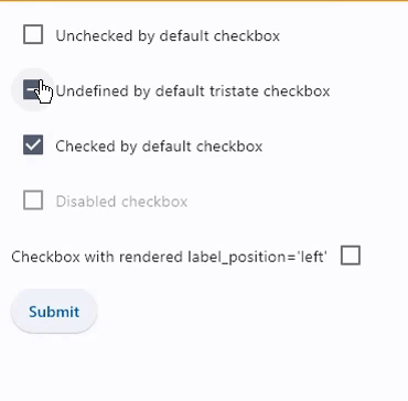
Basic Example#
import flet as ft


def main(page: ft.Page):
    def handle_button_click(e: ft.Event[ft.Button]):
        message.value = f"Checkboxes values are:  {c1.value}, {c2.value}, {c3.value}, "
        f"{c4.value}, {c5.value}."
        page.update()

    page.add(
        c1 := ft.Checkbox(label="Unchecked by default checkbox", value=False),
        c2 := ft.Checkbox(
            label="Undefined by default tristate checkbox", tristate=True
        ),
        c3 := ft.Checkbox(label="Checked by default checkbox", value=True),
        c4 := ft.Checkbox(label="Disabled checkbox", disabled=True),
        c5 := ft.Checkbox(
            label="Checkbox with LEFT label_position",
            label_position=ft.LabelPosition.LEFT,
        ),
        ft.Button(content="Submit", on_click=handle_button_click),
        message := ft.Text(),
    )


if __name__ == "__main__":
    ft.run(main)
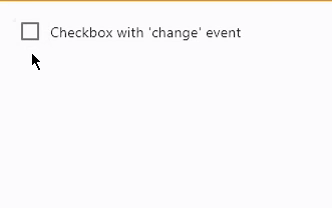
Handling events#
import flet as ft


def main(page: ft.Page):
    def handle_checkbox_change(e: ft.Event[ft.Checkbox]):
        page.add(ft.Text(f"Checkbox value changed to {e.control.value}"))
        page.update()

    page.add(
        ft.Checkbox(
            label="Checkbox with 'change' event",
            on_change=handle_checkbox_change,
        )
    )


ft.run(main)
Styled checkboxes#
import flet as ft


def main(page: ft.Page):
    page.add(
        ft.Checkbox(label="Checkbox with default style"),
        ft.Checkbox(
            label="Checkbox with constant fill color",
            fill_color=ft.Colors.RED,
            check_color=ft.Colors.YELLOW,
        ),
        ft.Checkbox(
            label="Checkbox with dynamic fill color",
            fill_color={
                ft.ControlState.HOVERED: ft.Colors.BLUE,
                ft.ControlState.SELECTED: ft.Colors.GREEN,
                ft.ControlState.DEFAULT: ft.Colors.RED,
            },
            # border_side={ft.ControlState.HOVERED: ft.BorderSide(width=1.0)},
        ),
    )


ft.run(main)
Bases: LayoutControl, AdaptiveControl
Checkbox allows to select one or more items from a group, or switch between two mutually exclusive options (checked or unchecked, on or off).
active_color: ColorValue | None = None
The color to use when this checkbox is checked.
adaptive: bool | None = None
Enables platform-specific rendering or inheritance of adaptiveness from parent controls.
animate_align: AnimationValue | None = None
Enables implicit animation of the [align][flet.LayoutControl.] property.
More information here.
animate_margin: AnimationValue | None = None
Enables implicit animation of the [margin][flet.LayoutControl.] property.
More information here.
animate_offset: AnimationValue | None = None
Enables implicit animation of the [offset][flet.LayoutControl.] property.
More information here.
animate_opacity: AnimationValue | None = None
Enables implicit animation of the [opacity][flet.LayoutControl.] property.
More information here.
animate_position: AnimationValue | None = None
Enables implicit animation of the positioning properties
([left][flet.LayoutControl.], [right][flet.LayoutControl.],
[top][flet.LayoutControl.] and [bottom][flet.LayoutControl.]).
More information here.
animate_rotation: AnimationValue | None = None
Enables implicit animation of the [rotate][flet.LayoutControl.] property.
More information here.
animate_scale: AnimationValue | None = None
Enables implicit animation of the [scale][flet.LayoutControl.] property.
More information here.
aspect_ratio: Number | None = None
The aspect ratio of the control. It is defined as the ratio of the width to the height.
autofocus: bool = False
True if the control will be selected as the initial focus. If there is more than one control on a page with autofocus set, then the first one added to the page will get focus.
border_side: ControlStateValue[BorderSide] | None = None
The color and width of this checkbox's border in all or specific
ControlStates.
Defaults to CheckboxTheme.border_side, or if that is None,
falls back to BorderSide with a width of 2.0.
Note
Supported states: ControlState.SELECTED,
ControlState.HOVERED, ControlState.DISABLED,
ControlState.FOCUSED, ControlState.PRESSED,
ControlState.ERROR, and ControlState.DEFAULT.
bottom: Number | None = None
The distance that the child's bottom edge is inset from the bottom of the stack.
Note
Effective only if this control is a descendant of one of the following:
[Stack][flet.] control, [Page.overlay][flet.] list.
check_color: ColorValue | None = None
The color to use for the check icon when this checkbox is checked.
col: ResponsiveNumber = 12
If a parent of this control is a [ResponsiveRow][flet.],
this property is used to determine
how many virtual columns of a screen this control will span.
Can be a number or a dictionary configured to have a different value for specific
breakpoints, for example col={"sm": 6}.
This control spans the 12 virtual columns by default.
Dimensions
| Breakpoint | Dimension |
|---|---|
| xs | <576px |
| sm | ≥576px |
| md | ≥768px |
| lg | ≥992px |
| xl | ≥1200px |
| xxl | ≥1400px |
disabled: bool = False
Every control has disabled property which is False by default - control and all
its children are enabled.
Note
The value of this property will be propagated down to all children controls recursively.
error: bool = False
Whether this checkbox wants to show an error state.
If True this checkbox will
have a different default container color and check color.
Specifies whether/how this control should expand to fill available space in its parent layout.
More information here.
Note
Has effect only if the direct parent of this control is one of the following
controls, or their subclasses: [Column][flet.], [Row][flet.],
[View][flet.], [Page][flet.].
expand_loose: bool = False
Allows the control to expand along the main axis if space is available, but does not require it to fill all available space.
More information here.
Note
If expand_loose is True, it will have effect only if:
expandis notNoneand- the direct parent of this control is one of the following controls, or their
subclasses: [
Column][flet.], [Row][flet.], [View][flet.], [Page][flet.].
fill_color: ControlStateValue[ColorValue] | None = None
The color that fills this checkbox in all or specific ControlStates.
Note
Supported states: ControlState.SELECTED,
ControlState.HOVERED, ControlState.DISABLED,
ControlState.FOCUSED, and ControlState.DEFAULT.
focus_color: ColorValue | None = None
The color for the checkbox's Material when it has the input focus.
If overlay_color returns a non-None color in the
ControlState.FOCUSED state, it will be used instead.
Defaults to CheckboxTheme.overlay_color in the
ControlState.FOCUSED state, or if that is None,
falls back to Theme.focus_color.
label: StrOrControl | None = None
The clickable label to display on the right of a checkbox.
label_position: LabelPosition = RIGHT
Defines on which side of the checkbox the label should be shown.
left: Number | None = None
The distance that the child's left edge is inset from the left of the stack.
Note
Effective only if this control is a descendant of one of the following:
[Stack][flet.] control, [Page.overlay][flet.] list.
mouse_cursor: MouseCursor | None = None
The cursor to be displayed when a mouse pointer enters or is hovering over this checkbox.
Defaults to CheckboxTheme.mouse_cursor,
or if that is None, falls back to MouseCursor.CLICK.
offset: OffsetValue | None = None
Applies a translation transformation before painting the control.
The translation is expressed as an Offset scaled to the control's size.
So, Offset(x=0.25, y=0), for example, will result in a horizontal translation
of one quarter the width of this control.
Example
The following example displays container at 0, 0 top left corner of a stack as
transform applies -1 * 100, -1 * 100 (offset * control's size) horizontal and
vertical translations to the control:
on_animation_end: (
    ControlEventHandler[LayoutControl] | None
) = None
Called when animation completes.
Can be used to chain multiple animations.
The data property of the event handler argument contains the name
of the animation.
More information here.
on_blur: ControlEventHandler[Checkbox] | None = None
Called when this checkbox has lost focus.
on_change: ControlEventHandler[Checkbox] | None = None
Called when the state of this checkbox is changed.
on_focus: ControlEventHandler[Checkbox] | None = None
Called when this checkbox has received focus.
opacity: Number = 1.0
Defines the transparency of the control.
Value ranges from 0.0 (completely transparent) to 1.0 (completely opaque
without any transparency).
overlay_color: ControlStateValue[ColorValue] | None = None
The color of this checkbox's overlay in various ControlState states.
Note
Supported states: ControlState.PRESSED,
ControlState.SELECTED, ControlState.HOVERED,
ControlState.FOCUSED, and ControlState.DEFAULT.
parent: BaseControl | None
The direct ancestor(parent) of this control.
It defaults to None and will only have a value when this control is mounted
(added to the page tree).
The Page control (which is the root of the tree) is an exception - it always
has parent=None.
right: Number | None = None
The distance that the child's right edge is inset from the right of the stack.
Note
Effective only if this control is a descendant of one of the following:
[Stack][flet.] control, [Page.overlay][flet.] list.
rotate: RotateValue | None = None
Transforms this control using a rotation around its center.
The value of rotate property could be one of the following types:
number- a rotation in clockwise radians. Full circle360°ismath.pi * 2radians,90°ispi / 2,45°ispi / 4, etc.Rotate- allows to specify rotationangleas well asalignment- the location of rotation center.
scale: ScaleValue | None = None
Scales this control along the 2D plane. Default scale factor is 1.0,
meaning no-scale.
Setting this property to 0.5, for example, makes this control twice smaller,
while 2.0 makes it twice larger.
Different scale multipliers can be specified for x and y axis, by setting
Control.scale property to an instance of Scale class.
Either scale or scale_x and scale_y could be specified, but not all of them.
semantics_label: str | None = None
The semantic label for the checkbox that is not shown in the UI, but will be announced by screen readers in accessibility modes (e.g TalkBack/VoiceOver).
shape: OutlinedBorder | None = None
The shape of the checkbox.
Defaults to CheckboxTheme.shape, or if that is None,
falls back to RoundedRectangleBorder(radius=2).
splash_radius: Number | None = None
The radius of the circular Material ink response (ripple) in logical pixels.
Defaults to CheckboxTheme.splash_radius,
or if that is None, falls back to 20.0.
tooltip: TooltipValue | None = None
The tooltip ot show when this control is hovered over.
top: Number | None = None
The distance that the child's top edge is inset from the top of the stack.
Note
Effective only if this control is a descendant of one of the following:
[Stack][flet.] control, [Page.overlay][flet.] list.
value: bool | None = False
The value of this checkbox.
- If
True, this checkbox is checked. - If
False, this checkbox is unchecked. - If
NoneandtristateisTrue, this checkbox is indeterminate (displayed as a dash).
visible: bool = True
Every control has visible property which is True by default - control is
rendered on the page. Setting visible to False completely prevents control (and
all its children if any) from rendering on a page canvas. Hidden controls cannot be
focused or selected with a keyboard or mouse and they do not emit any events.
visual_density: VisualDensity | None = None
Defines how compact the checkbox's layout will be.
Called once during control initialization to define its child controls. self.page is available in this method.