ExpansionTile
Examples#
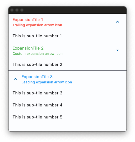
Basic Example#
import flet as ft


def main(page: ft.Page):
    page.theme_mode = ft.ThemeMode.LIGHT
    page.spacing = 0
    page.padding = 0

    def handle_expansion_tile_change(e: ft.Event[ft.ExpansionTile]):
        page.show_dialog(
            ft.SnackBar(
                duration=1000,
                content=ft.Text(
                    value=f"ExpansionTile was {'expanded' if e.data == 'true' else 'collapsed'}"
                ),
            )
        )
        if e.control.trailing:
            e.control.trailing.name = (
                ft.Icons.ARROW_DROP_DOWN
                if e.control.trailing.name == ft.Icons.ARROW_DROP_DOWN_CIRCLE
                else ft.Icons.ARROW_DROP_DOWN_CIRCLE
            )
            page.update()

    page.add(
        ft.ExpansionTile(
            title=ft.Text("ExpansionTile 1"),
            subtitle=ft.Text("Trailing expansion arrow icon"),
            bgcolor=ft.Colors.BLUE_GREY_200,
            collapsed_bgcolor=ft.Colors.BLUE_GREY_200,
            affinity=ft.TileAffinity.PLATFORM,
            maintain_state=True,
            collapsed_text_color=ft.Colors.RED,
            text_color=ft.Colors.RED,
            controls=[
                ft.ListTile(
                    title=ft.Text("This is sub-tile number 1"),
                    bgcolor=ft.Colors.BLUE_GREY_200,
                )
            ],
        ),
        ft.ExpansionTile(
            title=ft.Text("ExpansionTile 2"),
            subtitle=ft.Text("Custom expansion arrow icon"),
            trailing=ft.Icon(ft.Icons.ARROW_DROP_DOWN),
            collapsed_text_color=ft.Colors.GREEN,
            text_color=ft.Colors.GREEN,
            on_change=handle_expansion_tile_change,
            controls=[ft.ListTile(title=ft.Text("This is sub-tile number 2"))],
        ),
        ft.ExpansionTile(
            title=ft.Text("ExpansionTile 3"),
            subtitle=ft.Text("Leading expansion arrow icon"),
            affinity=ft.TileAffinity.LEADING,
            initially_expanded=True,
            collapsed_text_color=ft.Colors.BLUE_800,
            text_color=ft.Colors.BLUE_200,
            controls=[
                ft.ListTile(title=ft.Text("This is sub-tile number 3")),
                ft.ListTile(title=ft.Text("This is sub-tile number 4")),
                ft.ListTile(title=ft.Text("This is sub-tile number 5")),
            ],
        ),
    )


ft.run(main)
Theme mode toggle#
import flet as ft


def main(page: ft.Page):
    page.spacing = 0
    page.padding = 0

    def handle_switch_change(e: ft.Event[ft.Switch]):
        if page.theme_mode == ft.ThemeMode.DARK:
            page.theme_mode = ft.ThemeMode.LIGHT
            switch.thumb_icon = ft.Icons.LIGHT_MODE
        else:
            switch.thumb_icon = ft.Icons.DARK_MODE
            page.theme_mode = ft.ThemeMode.DARK
        page.update()

    def handle_expansion_tile_change(e: ft.Event[ft.ExpansionTile]):
        page.show_dialog(
            ft.SnackBar(
                duration=1000,
                content=ft.Text(
                    f"ExpansionTile was {'expanded' if e.data == 'true' else 'collapsed'}"
                ),
            )
        )
        if e.control.trailing:
            e.control.trailing.name = (
                ft.Icons.ARROW_DROP_DOWN
                if e.control.trailing.name == ft.Icons.ARROW_DROP_DOWN_CIRCLE
                else ft.Icons.ARROW_DROP_DOWN_CIRCLE
            )
            page.update()

    switch = ft.Switch(thumb_icon=ft.Icons.DARK_MODE, on_change=handle_switch_change)

    page.add(
        ft.ExpansionTile(
            title=ft.Text("ExpansionTile 1"),
            subtitle=ft.Text("Trailing expansion arrow icon"),
            bgcolor=ft.Colors.BLUE_GREY_200,
            collapsed_bgcolor=ft.Colors.BLUE_GREY_200,
            affinity=ft.TileAffinity.PLATFORM,
            maintain_state=True,
            collapsed_text_color=ft.Colors.RED,
            text_color=ft.Colors.RED,
            controls=[
                ft.ListTile(
                    title=ft.Text("This is sub-tile number 1"),
                    bgcolor=ft.Colors.BLUE_GREY_200,
                )
            ],
        ),
        ft.ExpansionTile(
            title=ft.Text("ExpansionTile 2"),
            subtitle=ft.Text("Custom expansion arrow icon"),
            trailing=ft.Icon(ft.Icons.ARROW_DROP_DOWN),
            collapsed_text_color=ft.Colors.GREEN,
            text_color=ft.Colors.GREEN,
            on_change=handle_expansion_tile_change,
            controls=[ft.ListTile(title=ft.Text("This is sub-tile number 2"))],
        ),
        ft.ExpansionTile(
            title=ft.Text("ExpansionTile 3"),
            subtitle=ft.Text("Leading expansion arrow icon"),
            affinity=ft.TileAffinity.LEADING,
            initially_expanded=True,
            collapsed_text_color=ft.Colors.BLUE_800,
            text_color=ft.Colors.BLUE_200,
            controls=[
                ft.ListTile(title=ft.Text("This is sub-tile number 3")),
                ft.ListTile(title=ft.Text("This is sub-tile number 4")),
                ft.ListTile(title=ft.Text("This is sub-tile number 5")),
            ],
        ),
        ft.Row(
            expand=True,
            alignment=ft.MainAxisAlignment.END,
            controls=[
                ft.Container(
                    content=switch,
                    padding=ft.Padding.only(bottom=50),
                    alignment=ft.Alignment.BOTTOM_RIGHT,
                    expand=True,
                ),
            ],
        ),
    )


ft.run(main)
Borders#
import flet as ft


def main(page: ft.Page):
    page.theme_mode = ft.ThemeMode.LIGHT

    page.add(
        ft.ExpansionTile(
            title=ft.Text(
                value="Expansion Tile with changing borders",
                text_align=ft.TextAlign.CENTER,
            ),
            subtitle=ft.Text(
                value="Tile border changes when expanded",
                text_align=ft.TextAlign.CENTER,
            ),
            bgcolor=ft.Colors.BLUE_GREY_200,
            controls_padding=ft.Padding.symmetric(horizontal=10),
            collapsed_bgcolor=ft.Colors.BLUE_GREY_200,
            affinity=ft.TileAffinity.PLATFORM,
            maintain_state=True,
            shape=ft.RoundedRectangleBorder(radius=20),
            collapsed_shape=ft.StadiumBorder(side=ft.BorderSide(width=2)),
            collapsed_text_color=ft.Colors.GREY_800,
            text_color=ft.Colors.GREY_800,
            controls=[
                ft.ListTile(
                    title=ft.Text("A sub-tile"),
                    bgcolor=ft.Colors.BLUE_GREY_200,
                    shape=ft.RoundedRectangleBorder(radius=20),
                    # shape=ft.StadiumBorder(),
                ),
                ft.ListTile(
                    title=ft.Text("Another sub-tile"),
                    bgcolor=ft.Colors.BLUE_GREY_200,
                    shape=ft.RoundedRectangleBorder(radius=20),
                    # shape=ft.StadiumBorder(),
                ),
            ],
        ),
    )


ft.run(main)
Bases: LayoutControl, AdaptiveControl
A single-line ListTile with an expansion arrow icon that expands or collapses the tile to reveal or hide its controls.
adaptive: bool | None = None
Enables platform-specific rendering or inheritance of adaptiveness from parent controls.
affinity: TileAffinity | None = None
Typically used to force the expansion arrow icon to the tile's leading or
trailing edge.
Defaults to TileAffinity.PLATFORM.
animate_align: AnimationValue | None = None
Enables implicit animation of the [align][flet.LayoutControl.] property.
More information here.
animate_margin: AnimationValue | None = None
Enables implicit animation of the [margin][flet.LayoutControl.] property.
More information here.
animate_offset: AnimationValue | None = None
Enables implicit animation of the [offset][flet.LayoutControl.] property.
More information here.
animate_opacity: AnimationValue | None = None
Enables implicit animation of the [opacity][flet.LayoutControl.] property.
More information here.
animate_position: AnimationValue | None = None
Enables implicit animation of the positioning properties
([left][flet.LayoutControl.], [right][flet.LayoutControl.],
[top][flet.LayoutControl.] and [bottom][flet.LayoutControl.]).
More information here.
animate_rotation: AnimationValue | None = None
Enables implicit animation of the [rotate][flet.LayoutControl.] property.
More information here.
animate_scale: AnimationValue | None = None
Enables implicit animation of the [scale][flet.LayoutControl.] property.
More information here.
aspect_ratio: Number | None = None
The aspect ratio of the control. It is defined as the ratio of the width to the height.
bottom: Number | None = None
The distance that the child's bottom edge is inset from the bottom of the stack.
Note
Effective only if this control is a descendant of one of the following:
[Stack][flet.] control, [Page.overlay][flet.] list.
clip_behavior: ClipBehavior | None = None
The content will be clipped (or not) according to this option.
Defaults to ClipBehavior.NONE.
col: ResponsiveNumber = 12
If a parent of this control is a [ResponsiveRow][flet.],
this property is used to determine
how many virtual columns of a screen this control will span.
Can be a number or a dictionary configured to have a different value for specific
breakpoints, for example col={"sm": 6}.
This control spans the 12 virtual columns by default.
Dimensions
| Breakpoint | Dimension |
|---|---|
| xs | <576px |
| sm | ≥576px |
| md | ≥768px |
| lg | ≥992px |
| xl | ≥1200px |
| xxl | ≥1400px |
collapsed_bgcolor: ColorValue | None = None
Defines the background color of tile when the sublist is collapsed.
collapsed_icon_color: ColorValue | None = None
The icon color of tile's expansion arrow icon when the sublist is collapsed.
collapsed_shape: OutlinedBorder | None = None
The tile's border shape when the sublist is collapsed.
collapsed_text_color: ColorValue | None = None
The color of the tile's titles when the sublist is collapsed.
The controls to be displayed when the tile expands.
Typically a list of ListTile controls.
controls_padding: PaddingValue | None = None
Defines the padding around the controls.
dense: bool | None = None
Whether this list tile is part of a vertically dense list. Dense list tiles default to a smaller height.
It is not recommended to set this property to True when in Material3.
disabled: bool = False
Every control has disabled property which is False by default - control and all
its children are enabled.
Note
The value of this property will be propagated down to all children controls recursively.
enable_feedback: bool = True
Whether detected gestures should provide acoustic and/or haptic feedback. For example, on Android a tap will produce a clicking sound and a long-press will produce a short vibration, when feedback is enabled.
Defaults to True.
Specifies whether/how this control should expand to fill available space in its parent layout.
More information here.
Note
Has effect only if the direct parent of this control is one of the following
controls, or their subclasses: [Column][flet.], [Row][flet.],
[View][flet.], [Page][flet.].
expand_loose: bool = False
Allows the control to expand along the main axis if space is available, but does not require it to fill all available space.
More information here.
Note
If expand_loose is True, it will have effect only if:
expandis notNoneand- the direct parent of this control is one of the following controls, or their
subclasses: [
Column][flet.], [Row][flet.], [View][flet.], [Page][flet.].
expanded_alignment: Alignment | None = None
Defines the alignment of children, which are arranged in a column when the tile is expanded.
expanded_cross_axis_alignment: CrossAxisAlignment = CENTER
Defines the alignment of each child control within controls when the tile is
expanded.
icon_color: ColorValue | None = None
The icon color of tile's expansion arrow icon when the sublist is expanded.
initially_expanded: bool = False
A boolean value which defines whether the tile is initially expanded or collapsed.
Defaults to False.
left: Number | None = None
The distance that the child's left edge is inset from the left of the stack.
Note
Effective only if this control is a descendant of one of the following:
[Stack][flet.] control, [Page.overlay][flet.] list.
maintain_state: bool = False
A boolean value which defines whether the state of the controls is maintained
when the tile expands and collapses.
Defaults to False.
offset: OffsetValue | None = None
Applies a translation transformation before painting the control.
The translation is expressed as an Offset scaled to the control's size.
So, Offset(x=0.25, y=0), for example, will result in a horizontal translation
of one quarter the width of this control.
Example
The following example displays container at 0, 0 top left corner of a stack as
transform applies -1 * 100, -1 * 100 (offset * control's size) horizontal and
vertical translations to the control:
on_animation_end: (
    ControlEventHandler[LayoutControl] | None
) = None
Called when animation completes.
Can be used to chain multiple animations.
The data property of the event handler argument contains the name
of the animation.
More information here.
on_change: ControlEventHandler[ExpansionTile] | None = None
Called when a user clicks or taps the list tile.
opacity: Number = 1.0
Defines the transparency of the control.
Value ranges from 0.0 (completely transparent) to 1.0 (completely opaque
without any transparency).
parent: BaseControl | None
The direct ancestor(parent) of this control.
It defaults to None and will only have a value when this control is mounted
(added to the page tree).
The Page control (which is the root of the tree) is an exception - it always
has parent=None.
right: Number | None = None
The distance that the child's right edge is inset from the right of the stack.
Note
Effective only if this control is a descendant of one of the following:
[Stack][flet.] control, [Page.overlay][flet.] list.
rotate: RotateValue | None = None
Transforms this control using a rotation around its center.
The value of rotate property could be one of the following types:
number- a rotation in clockwise radians. Full circle360°ismath.pi * 2radians,90°ispi / 2,45°ispi / 4, etc.Rotate- allows to specify rotationangleas well asalignment- the location of rotation center.
scale: ScaleValue | None = None
Scales this control along the 2D plane. Default scale factor is 1.0,
meaning no-scale.
Setting this property to 0.5, for example, makes this control twice smaller,
while 2.0 makes it twice larger.
Different scale multipliers can be specified for x and y axis, by setting
Control.scale property to an instance of Scale class.
Either scale or scale_x and scale_y could be specified, but not all of them.
show_trailing_icon: bool = True
Whether to show the trailing icon (be it the default icon or the custom trailing,
if specified and visible).
Defaults to True.
subtitle: StrOrControl | None = None
Additional content displayed below the title.
Typically a Text control.
text_color: ColorValue | None = None
The color of the tile's titles when the sublist is expanded.
tile_padding: PaddingValue | None = None
Defines the tile's padding. Default value is Padding.symmetric(horizontal=16.0).
title: StrOrControl
A Control to display as primary content of the tile.
Typically a Text control.
tooltip: TooltipValue | None = None
The tooltip ot show when this control is hovered over.
top: Number | None = None
The distance that the child's top edge is inset from the top of the stack.
Note
Effective only if this control is a descendant of one of the following:
[Stack][flet.] control, [Page.overlay][flet.] list.
trailing: IconDataOrControl | None = None
A Control to display after the title.
Typically an Icon control.
visible: bool = True
Every control has visible property which is True by default - control is
rendered on the page. Setting visible to False completely prevents control (and
all its children if any) from rendering on a page canvas. Hidden controls cannot be
focused or selected with a keyboard or mouse and they do not emit any events.
visual_density: VisualDensity | None = None
Defines how compact the control's layout will be.
Called once during control initialization to define its child controls. self.page is available in this method.