GestureDetector
Examples#
Handling events#
import flet as ft


def main(page: ft.Page):
    page.add(
        ft.GestureDetector(
            content=ft.Container(bgcolor=ft.Colors.GREEN, width=200, height=200),
            hover_interval=50,
            on_tap=lambda e: print(e),
            on_tap_down=lambda e: print(e),
            on_tap_up=lambda e: print(e),
            on_secondary_tap=lambda e: print(e),
            on_secondary_tap_down=lambda e: print(e),
            on_secondary_tap_up=lambda e: print(e),
            on_long_press_start=lambda e: print(e),
            on_long_press_end=lambda e: print(e),
            on_secondary_long_press_start=lambda e: print(e),
            on_secondary_long_press_end=lambda e: print(e),
            on_double_tap=lambda e: print(e),
            on_double_tap_down=lambda e: print(e),
            on_pan_start=lambda e: print(e),
            on_pan_update=lambda e: print(e),
            on_pan_end=lambda e: print(e),
            on_hover=lambda e: print(e),
            on_enter=lambda e: print(e),
            on_exit=lambda e: print(e),
        )
    )


ft.run(main)
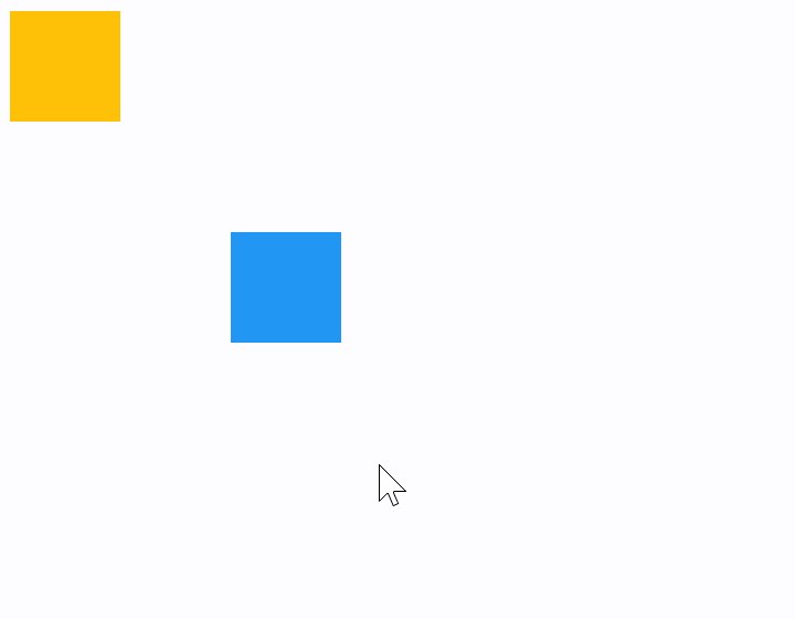
Draggable containers#
The following example demonstrates how a control can be freely dragged inside a Stack.
The sample also shows that GestureDetector can have a child control (blue container) as well as be nested inside another control (yellow container) giving the same results.
import flet as ft


def main(page: ft.Page):
    def handle_pan_update1(e: ft.DragUpdateEvent[ft.GestureDetector]):
        container = e.control.parent
        container.top = max(0.0, container.top + e.delta_y)
        container.left = max(0.0, container.left + e.delta_x)
        container.update()

    def handle_pan_update2(e: ft.DragUpdateEvent[ft.GestureDetector]):
        e.control.top = max(0.0, e.control.top + e.delta_y)
        e.control.left = max(0.0, e.control.left + e.delta_x)
        e.control.update()

    page.add(
        ft.Stack(
            width=1000,
            height=500,
            controls=[
                ft.Container(
                    bgcolor=ft.Colors.AMBER,
                    width=50,
                    height=50,
                    left=0,
                    top=0,
                    content=ft.GestureDetector(
                        mouse_cursor=ft.MouseCursor.MOVE,
                        drag_interval=50,
                        on_pan_update=handle_pan_update1,
                    ),
                ),
                ft.GestureDetector(
                    mouse_cursor=ft.MouseCursor.MOVE,
                    drag_interval=10,
                    on_vertical_drag_update=handle_pan_update2,
                    left=100,
                    top=100,
                    content=ft.Container(bgcolor=ft.Colors.BLUE, width=50, height=50),
                ),
            ],
        )
    )


ft.run(main)
Window drag area#
import flet as ft


def main(page: ft.Page):
    def on_pan_update(e: ft.DragUpdateEvent[ft.GestureDetector]):
        page.window.left += e.global_delta.x
        page.window.top += e.global_delta.y
        page.update()

    page.add(
        ft.Stack(
            width=1000,
            height=500,
            controls=[
                ft.GestureDetector(
                    mouse_cursor=ft.MouseCursor.MOVE,
                    on_pan_update=on_pan_update,
                    left=200,
                    top=200,
                    content=ft.Container(bgcolor=ft.Colors.PINK, width=50, height=50),
                ),
            ],
        )
    )


ft.run(main)
Mouse Cursors#
import flet as ft


def main(page: ft.Page):
    def on_pan_update(event: ft.DragUpdateEvent[ft.GestureDetector]):
        container.top = max(0.0, container.top + event.delta_y)
        container.left = max(0.0, container.left + event.delta_x)
        container.update()

    gesture_detector = ft.GestureDetector(
        mouse_cursor=ft.MouseCursor.BASIC,
        drag_interval=50,
        on_pan_update=on_pan_update,
    )
    container = ft.Container(
        content=gesture_detector,
        bgcolor=ft.Colors.AMBER,
        width=150,
        height=150,
        left=0,
        top=0,
    )

    def handle_button_click(e: ft.Event[ft.Button]):
        gesture_detector.mouse_cursor = next(
            generate_mouse_cursors(list(ft.MouseCursor))
        )
        text.value = f"Mouse Cursor:  {gesture_detector.mouse_cursor}"
        page.update()

    def generate_mouse_cursors(m_list):
        while True:
            yield from m_list

    page.add(
        ft.Stack(controls=[container], width=1000, height=500),
        ft.Button("Change mouse Cursor", on_click=handle_button_click),
        text := ft.Text(f"Mouse Cursor:  {gesture_detector.mouse_cursor}"),
    )


ft.run(main)
Bases: LayoutControl, AdaptiveControl
A control that detects gestures.
Attempts to recognize gestures that correspond to its non-None callbacks.
If this control has a content, it defers to that child control for
its sizing behavior, else it grows to fit the parent instead.
adaptive: bool | None = None
Enables platform-specific rendering or inheritance of adaptiveness from parent controls.
animate_align: AnimationValue | None = None
Enables implicit animation of the [align][flet.LayoutControl.] property.
More information here.
animate_margin: AnimationValue | None = None
Enables implicit animation of the [margin][flet.LayoutControl.] property.
More information here.
animate_offset: AnimationValue | None = None
Enables implicit animation of the [offset][flet.LayoutControl.] property.
More information here.
animate_opacity: AnimationValue | None = None
Enables implicit animation of the [opacity][flet.LayoutControl.] property.
More information here.
animate_position: AnimationValue | None = None
Enables implicit animation of the positioning properties
([left][flet.LayoutControl.], [right][flet.LayoutControl.],
[top][flet.LayoutControl.] and [bottom][flet.LayoutControl.]).
More information here.
animate_rotation: AnimationValue | None = None
Enables implicit animation of the [rotate][flet.LayoutControl.] property.
More information here.
animate_scale: AnimationValue | None = None
Enables implicit animation of the [scale][flet.LayoutControl.] property.
More information here.
aspect_ratio: Number | None = None
The aspect ratio of the control. It is defined as the ratio of the width to the height.
bottom: Number | None = None
The distance that the child's bottom edge is inset from the bottom of the stack.
Note
Effective only if this control is a descendant of one of the following:
[Stack][flet.] control, [Page.overlay][flet.] list.
col: ResponsiveNumber = 12
If a parent of this control is a [ResponsiveRow][flet.],
this property is used to determine
how many virtual columns of a screen this control will span.
Can be a number or a dictionary configured to have a different value for specific
breakpoints, for example col={"sm": 6}.
This control spans the 12 virtual columns by default.
Dimensions
| Breakpoint | Dimension |
|---|---|
| xs | <576px |
| sm | ≥576px |
| md | ≥768px |
| lg | ≥992px |
| xl | ≥1200px |
| xxl | ≥1400px |
disabled: bool = False
Every control has disabled property which is False by default - control and all
its children are enabled.
Note
The value of this property will be propagated down to all children controls recursively.
drag_interval: int = 0
Throttling in milliseconds for horizontal drag, vertical drag and pan update events.
When a user moves a pointer a lot of events are being generated to do precise
tracking. drag_interval allows sending drag update events to a Flet program every
X milliseconds, thus preserving the bandwidth (web and mobile apps).
Default is 0 - no throttling, all events are sent to a Flet program, very smooth
tracking.
Specifies whether/how this control should expand to fill available space in its parent layout.
More information here.
Note
Has effect only if the direct parent of this control is one of the following
controls, or their subclasses: [Column][flet.], [Row][flet.],
[View][flet.], [Page][flet.].
expand_loose: bool = False
Allows the control to expand along the main axis if space is available, but does not require it to fill all available space.
More information here.
Note
If expand_loose is True, it will have effect only if:
expandis notNoneand- the direct parent of this control is one of the following controls, or their
subclasses: [
Column][flet.], [Row][flet.], [View][flet.], [Page][flet.].
left: Number | None = None
The distance that the child's left edge is inset from the left of the stack.
Note
Effective only if this control is a descendant of one of the following:
[Stack][flet.] control, [Page.overlay][flet.] list.
mouse_cursor: MouseCursor | None = None
The mouse cursor for mouse pointers that are hovering over the control.
multi_tap_touches: int = 0
The minimum number of pointers to trigger on_multi_tap event.
offset: OffsetValue | None = None
Applies a translation transformation before painting the control.
The translation is expressed as an Offset scaled to the control's size.
So, Offset(x=0.25, y=0), for example, will result in a horizontal translation
of one quarter the width of this control.
Example
The following example displays container at 0, 0 top left corner of a stack as
transform applies -1 * 100, -1 * 100 (offset * control's size) horizontal and
vertical translations to the control:
on_animation_end: (
    ControlEventHandler[LayoutControl] | None
) = None
Called when animation completes.
Can be used to chain multiple animations.
The data property of the event handler argument contains the name
of the animation.
More information here.
on_double_tap: (
    EventHandler[TapEvent[GestureDetector]] | None
) = None
The user has tapped the screen with a primary button at the same location twice in quick succession.
on_double_tap_down: (
    EventHandler[TapEvent[GestureDetector]] | None
) = None
Called when a pointer that might cause a double tap has contacted the screen at a particular location.
Triggered immediately after the down event of the second tap.
on_enter: (
    EventHandler[HoverEvent[GestureDetector]] | None
) = None
Called when a mouse pointer has entered this control.
on_exit: (
    EventHandler[HoverEvent[GestureDetector]] | None
) = None
Called when a mouse pointer has exited this control.
on_horizontal_drag_end: (
    EventHandler[DragEndEvent[GestureDetector]] | None
) = None
Called when a pointer moving horizontally is no longer in contact and was moving at a specific velocity.
on_horizontal_drag_start: (
    EventHandler[DragStartEvent[GestureDetector]] | None
) = None
Called when a pointer has contacted the screen with a primary button and has begun to move horizontally.
on_horizontal_drag_update: (
    EventHandler[DragUpdateEvent[GestureDetector]] | None
) = None
Called when a pointer that is in contact with the screen and moving horizontally has moved in the horizontal direction.
on_hover: (
    EventHandler[HoverEvent[GestureDetector]] | None
) = None
Called when a mouse pointer has entered this control.
on_long_press_end: (
    EventHandler[LongPressEndEvent[GestureDetector]] | None
) = None
Called when a pointer that has triggered a long-press with a primary button has stopped contacting the screen.
on_long_press_start: (
    EventHandler[LongPressStartEvent[GestureDetector]]
    | None
) = None
Called when a long press gesture with a primary button has been recognized.
Triggered when a pointer has remained in contact with the screen at the same location for a long period of time.
on_multi_long_press: (
    EventHandler[LongPressEndEvent[GestureDetector]] | None
) = None
Called when a long press gesture with multiple pointers has been recognized.
on_multi_tap: (
    EventHandler[TapEvent[GestureDetector]] | None
) = None
Called when multiple pointers contacted the screen.
on_pan_end: (
    EventHandler[DragEndEvent[GestureDetector]] | None
) = None
Called when a pointer is no longer in contact and was moving at a specific velocity.
on_pan_start: (
    EventHandler[DragStartEvent[GestureDetector]] | None
) = None
Called when a pointer has contacted the screen and has begun to move.
on_pan_update: (
    EventHandler[DragUpdateEvent[GestureDetector]] | None
) = None
Called when a pointer that is in contact with the screen and moving has moved again.
on_right_pan_end: (
    EventHandler[PointerEvent[GestureDetector]] | None
) = None
A pointer with secondary button pressed is no longer in contact and was moving at a specific velocity.
on_right_pan_start: (
    EventHandler[PointerEvent[GestureDetector]] | None
) = None
Pointer has contacted the screen while secondary button pressed and has begun to move.
on_right_pan_update: (
    EventHandler[PointerEvent[GestureDetector]] | None
) = None
A pointer that is in contact with the screen, secondary button pressed and moving has moved again.
on_scale_start: (
    EventHandler[ScaleStartEvent[GestureDetector]] | None
) = None
Called when the pointers in contact with the screen have established a focal
point and initial scale of 1.0.
on_scale_update: (
    EventHandler[ScaleUpdateEvent[GestureDetector]] | None
) = None
TBD
on_secondary_long_press_end: (
    EventHandler[LongPressEndEvent[GestureDetector]] | None
) = None
Called when a pointer that has triggered a long-press with a secondary button has stopped contacting the screen.
on_secondary_long_press_start: (
    EventHandler[LongPressStartEvent[GestureDetector]]
    | None
) = None
Called when a long press gesture with a secondary button has been recognized.
Triggered when a pointer has remained in contact with the screen at the same location for a long period of time.
on_secondary_tap: (
    EventHandler[TapEvent[GestureDetector]] | None
) = None
A tap with a secondary button has occurred.
on_secondary_tap_down: (
    EventHandler[TapEvent[GestureDetector]] | None
) = None
Called when a pointer that might cause a tap with a secondary button has contacted the screen at a particular location.
on_secondary_tap_up: (
    EventHandler[TapEvent[GestureDetector]] | None
) = None
Called when a pointer that will trigger a tap with a secondary button has stopped contacting the screen at a particular location.
on_tap: EventHandler[TapEvent[GestureDetector]] | None = (
    None
)
Called when a tap with a primary button has occurred.
on_tap_down: (
    EventHandler[TapEvent[GestureDetector]] | None
) = None
Called when a pointer that might cause a tap with a primary button has contacted the screen at a particular location.
on_tap_up: (
    EventHandler[TapEvent[GestureDetector]] | None
) = None
Called when a pointer that will trigger a tap with a primary button has stopped contacting the screen at a particular location.
on_vertical_drag_end: (
    EventHandler[DragEndEvent[GestureDetector]] | None
) = None
Called when a pointer moving vertically is no longer in contact and was moving at a specific velocity.
on_vertical_drag_start: (
    EventHandler[DragStartEvent[GestureDetector]] | None
) = None
Called when a pointer has contacted the screen and has begun to move vertically.
on_vertical_drag_update: (
    EventHandler[DragUpdateEvent[GestureDetector]] | None
) = None
A pointer moving vertically has moved in the vertical direction.
opacity: Number = 1.0
Defines the transparency of the control.
Value ranges from 0.0 (completely transparent) to 1.0 (completely opaque
without any transparency).
parent: BaseControl | None
The direct ancestor(parent) of this control.
It defaults to None and will only have a value when this control is mounted
(added to the page tree).
The Page control (which is the root of the tree) is an exception - it always
has parent=None.
right: Number | None = None
The distance that the child's right edge is inset from the right of the stack.
Note
Effective only if this control is a descendant of one of the following:
[Stack][flet.] control, [Page.overlay][flet.] list.
rotate: RotateValue | None = None
Transforms this control using a rotation around its center.
The value of rotate property could be one of the following types:
number- a rotation in clockwise radians. Full circle360°ismath.pi * 2radians,90°ispi / 2,45°ispi / 4, etc.Rotate- allows to specify rotationangleas well asalignment- the location of rotation center.
scale: ScaleValue | None = None
Scales this control along the 2D plane. Default scale factor is 1.0,
meaning no-scale.
Setting this property to 0.5, for example, makes this control twice smaller,
while 2.0 makes it twice larger.
Different scale multipliers can be specified for x and y axis, by setting
Control.scale property to an instance of Scale class.
Either scale or scale_x and scale_y could be specified, but not all of them.
tooltip: TooltipValue | None = None
The tooltip ot show when this control is hovered over.
top: Number | None = None
The distance that the child's top edge is inset from the top of the stack.
Note
Effective only if this control is a descendant of one of the following:
[Stack][flet.] control, [Page.overlay][flet.] list.
visible: bool = True
Every control has visible property which is True by default - control is
rendered on the page. Setting visible to False completely prevents control (and
all its children if any) from rendering on a page canvas. Hidden controls cannot be
focused or selected with a keyboard or mouse and they do not emit any events.
Called once during control initialization to define its child controls. self.page is available in this method.