Image
Examples#
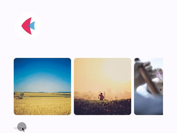
Displaying an image#
import flet as ft


def main(page: ft.Page):
    page.title = "Image Example"
    page.theme_mode = ft.ThemeMode.LIGHT
    page.padding = 50

    page.add(
        ft.Image(
            src="/icons/icon-512.png",
            width=100,
            height=100,
            fit=ft.BoxFit.CONTAIN,
        ),
        gallery := ft.Row(expand=1, wrap=False, scroll=ft.ScrollMode.ALWAYS),
    )

    for i in range(0, 30):
        gallery.controls.append(
            ft.Image(
                src=f"https://picsum.photos/200/200?{i}",
                width=200,
                height=200,
                fit=ft.BoxFit.NONE,
                repeat=ft.ImageRepeat.NO_REPEAT,
                border_radius=ft.BorderRadius.all(10),
            )
        )
    page.update()


ft.run(main)
Displaying a base64 image#
Displaying a static SVG image#
import flet as ft


def main(page: ft.Page):
    svg_image = """
<svg version="1.1" id="Layer_1" xmlns="http://www.w3.org/2000/svg" xmlns:xlink="http://www.w3.org/1999/xlink" x="0px" y="0px"
     viewBox="0 0 30 30" style="enable-background:new 0 0 30 30;" xml:space="preserve">
<g>
    <path d="M14.43339,18.88085c2.15923,0,3.91203-1.7476,3.91203-3.91226c0-2.15805-1.7528-3.90566-3.91723-3.90566
        c-0.74107,0-1.43221,0.21538-2.02332,0.57576c0.18598-0.05526,0.37562-0.09493,0.58084-0.09493
        c1.09756,0,1.98365,0.88609,1.98365,1.98235c0,1.09248-0.88608,1.98376-1.98365,1.98376
        c-1.09627,0-1.98235-0.88608-1.98235-1.98376c0-0.20499,0.03979-0.39486,0.09493-0.58096
        c-0.36027,0.59135-0.57576,1.28236-0.57576,2.02344C10.52254,17.13325,12.27026,18.88085,14.43339,18.88085z"/>
    <path d="M24.55235,1.00006H5.44812C2.99534,1.00006,1,2.99563,1,5.44747v19.10459c0,2.45278,1.99533,4.44788,4.44812,4.44788
        h19.10423c2.45243,0,4.44765-1.9951,4.44765-4.44788V5.44747C29,2.99563,27.00479,1.00006,24.55235,1.00006z M27.32951,24.55206
        c0,1.53175-1.246,2.77774-2.77715,2.77774H5.44812c-1.53151,0-2.77751-1.246-2.77751-2.77774v-8.83719h4.08065
        c0.37644,3.90943,3.67563,6.97482,7.67705,6.97482c4.00709,0,7.3065-3.06539,7.68295-6.97482h5.21824V24.55206z M8.36366,14.96859
        c0-3.34831,2.7161-6.06418,6.06453-6.06418c3.35469,0,6.07079,2.71587,6.07079,6.06418c0,3.35492-2.7161,6.07079-6.07079,6.07079
        C11.07977,21.03938,8.36366,18.32351,8.36366,14.96859z M27.32951,13.75472h-5.28579
        c-0.58568-3.67705-3.77116-6.5006-7.61541-6.5006c-3.83882,0-7.02383,2.82356-7.60951,6.5006H2.67061V5.44747
        c0-1.53128,1.246-2.7768,2.77751-2.7768h19.10423c1.53116,0,2.77715,1.24552,2.77715,2.7768V13.75472z"/>
    <path d="M24.06196,5.11637h-1.75185c-0.48236,0-0.87593,0.39345-0.87593,0.87569v1.75186
        c0,0.48225,0.39356,0.87616,0.87593,0.87616h1.75186c0.47776,0,0.87038-0.39392,0.87038-0.87616V5.99205
        C24.93234,5.50982,24.53972,5.11637,24.06196,5.11637z"/>
</g>
</svg>"""

    page.add(
        ft.Image(
            src="https://raw.githubusercontent.com/dnfield/flutter_svg/master/packages/flutter_svg/example/assets/wikimedia/Firefox_Logo_2017.svg",
            width=200,
            height=200,
        ),
        ft.Image(src=svg_image, width=100, height=100, color=ft.Colors.RED),
        ft.Image(src=svg_image, width=100, height=100, color=ft.Colors.BLUE),
        ft.Container(
            bgcolor=ft.Colors.BLACK87,
            border_radius=5,
            content=ft.Image(
                src=svg_image,
                width=100,
                height=100,
                color=ft.Colors.WHITE,
            ),
        ),
    )


ft.run(main)
Displaying a dynamic SVG image#
import asyncio

import flet as ft


async def main(page: ft.Page):
    svg_image = """
<svg width="400" height="400" xmlns="http://www.w3.org/2000/svg">
 <g>
  <ellipse ry="{}" rx="{}" id="svg_1" cy="200" cx="200" stroke="#000" fill="#fff"/>
 </g>
</svg>
"""

    img = ft.Image(src=svg_image.format(0, 0))
    page.add(img)

    for c in range(0, 10):
        for i in range(0, 10):
            img.src = svg_image.format(i * 10, i * 10)
            img.update()
            await asyncio.sleep(0.1)


ft.run(main)
Displaying a Lucide icon#
import flet as ft

"""
- Browse Lucide icons: https://lucide.dev/
- Copy SVG and use it as value for `Image.src`
"""


def main(page: ft.Page):
    page.add(
        ft.Image(
            src='<svg xmlns="http://www.w3.org/2000/svg" width="24" height="24" viewBox="0 0 24 24" fill="none" stroke="currentColor" stroke-width="2" stroke-linecap="round" stroke-linejoin="round"><path d="M21 7.5V6a2 2 0 0 0-2-2H5a2 2 0 0 0-2 2v14a2 2 0 0 0 2 2h3.5"></path><path d="M16 2v4"></path><path d="M8 2v4"></path><path d="M3 10h5"></path><path d="M17.5 17.5 16 16.25V14"></path><path d="M22 16a6 6 0 1 1-12 0 6 6 0 0 1 12 0Z"></path></svg>',
            color=ft.Colors.PINK,
        ),
        ft.Image(
            src='<svg xmlns="http://www.w3.org/2000/svg" width="24" height="24" viewBox="0 0 24 24" fill="none" stroke="currentColor" stroke-width="2" stroke-linecap="round" stroke-linejoin="round"><path d="M22 11.08V12a10 10 0 1 1-5.93-9.14"></path><polyline points="22 4 12 14.01 9 11.01"></polyline></svg>',
            color=ft.Colors.GREEN,
        ),
    )


ft.run(main)
Bases: LayoutControl
Displays an image. The following popular formats are supported: JPEG, PNG, SVG, GIF, Animated GIF, WebP, Animated WebP, BMP, and WBMP.
The source can be specified through one of the following properties (in order of precedence):
animate_align: AnimationValue | None = None
Enables implicit animation of the [align][flet.LayoutControl.] property.
More information here.
animate_margin: AnimationValue | None = None
Enables implicit animation of the [margin][flet.LayoutControl.] property.
More information here.
animate_offset: AnimationValue | None = None
Enables implicit animation of the [offset][flet.LayoutControl.] property.
More information here.
animate_opacity: AnimationValue | None = None
Enables implicit animation of the [opacity][flet.LayoutControl.] property.
More information here.
animate_position: AnimationValue | None = None
Enables implicit animation of the positioning properties
([left][flet.LayoutControl.], [right][flet.LayoutControl.],
[top][flet.LayoutControl.] and [bottom][flet.LayoutControl.]).
More information here.
animate_rotation: AnimationValue | None = None
Enables implicit animation of the [rotate][flet.LayoutControl.] property.
More information here.
animate_scale: AnimationValue | None = None
Enables implicit animation of the [scale][flet.LayoutControl.] property.
More information here.
anti_alias: bool = False
Whether to paint the image with anti-aliasing.
Anti-aliasing alleviates the sawtooth artifact when the image is rotated.
aspect_ratio: Number | None = None
The aspect ratio of the control. It is defined as the ratio of the width to the height.
bottom: Number | None = None
The distance that the child's bottom edge is inset from the bottom of the stack.
Note
Effective only if this control is a descendant of one of the following:
[Stack][flet.] control, [Page.overlay][flet.] list.
cache_height: int | None = None
The size at which the image should be decoded.
The image will, however, be rendered to the constraints of the layout regardless of this parameter.
cache_width: int | None = None
The size at which the image should be decoded.
The image will, however, be rendered to the constraints of the layout regardless of this parameter.
col: ResponsiveNumber = 12
If a parent of this control is a [ResponsiveRow][flet.],
this property is used to determine
how many virtual columns of a screen this control will span.
Can be a number or a dictionary configured to have a different value for specific
breakpoints, for example col={"sm": 6}.
This control spans the 12 virtual columns by default.
Dimensions
| Breakpoint | Dimension |
|---|---|
| xs | <576px |
| sm | ≥576px |
| md | ≥768px |
| lg | ≥992px |
| xl | ≥1200px |
| xxl | ≥1400px |
color: ColorValue | None = None
If set, this color is blended with each
image pixel using color_blend_mode.
color_blend_mode: BlendMode | None = None
Used to combine color with the image.
In terms of the blend mode, color is the source and this image is the destination.
disabled: bool = False
Every control has disabled property which is False by default - control and all
its children are enabled.
Note
The value of this property will be propagated down to all children controls recursively.
error_content: Control | None = None
Fallback control to display if the image cannot be loaded
from the provided sources (src or src_base64).
exclude_from_semantics: bool = False
Whether to exclude this image from semantics.
Specifies whether/how this control should expand to fill available space in its parent layout.
More information here.
Note
Has effect only if the direct parent of this control is one of the following
controls, or their subclasses: [Column][flet.], [Row][flet.],
[View][flet.], [Page][flet.].
expand_loose: bool = False
Allows the control to expand along the main axis if space is available, but does not require it to fill all available space.
More information here.
Note
If expand_loose is True, it will have effect only if:
expandis notNoneand- the direct parent of this control is one of the following controls, or their
subclasses: [
Column][flet.], [Row][flet.], [View][flet.], [Page][flet.].
gapless_playback: bool = False
Whether to continue showing the old image (True), or briefly show nothing
(False), when the image provider changes.
Has no effect on svg images.
left: Number | None = None
The distance that the child's left edge is inset from the left of the stack.
Note
Effective only if this control is a descendant of one of the following:
[Stack][flet.] control, [Page.overlay][flet.] list.
offset: OffsetValue | None = None
Applies a translation transformation before painting the control.
The translation is expressed as an Offset scaled to the control's size.
So, Offset(x=0.25, y=0), for example, will result in a horizontal translation
of one quarter the width of this control.
Example
The following example displays container at 0, 0 top left corner of a stack as
transform applies -1 * 100, -1 * 100 (offset * control's size) horizontal and
vertical translations to the control:
on_animation_end: (
    ControlEventHandler[LayoutControl] | None
) = None
Called when animation completes.
Can be used to chain multiple animations.
The data property of the event handler argument contains the name
of the animation.
More information here.
opacity: Number = 1.0
Defines the transparency of the control.
Value ranges from 0.0 (completely transparent) to 1.0 (completely opaque
without any transparency).
parent: BaseControl | None
The direct ancestor(parent) of this control.
It defaults to None and will only have a value when this control is mounted
(added to the page tree).
The Page control (which is the root of the tree) is an exception - it always
has parent=None.
repeat: ImageRepeat = NO_REPEAT
How to paint any portions of the layout bounds not covered by the image.
right: Number | None = None
The distance that the child's right edge is inset from the right of the stack.
Note
Effective only if this control is a descendant of one of the following:
[Stack][flet.] control, [Page.overlay][flet.] list.
rotate: RotateValue | None = None
Transforms this control using a rotation around its center.
The value of rotate property could be one of the following types:
number- a rotation in clockwise radians. Full circle360°ismath.pi * 2radians,90°ispi / 2,45°ispi / 4, etc.Rotate- allows to specify rotationangleas well asalignment- the location of rotation center.
scale: ScaleValue | None = None
Scales this control along the 2D plane. Default scale factor is 1.0,
meaning no-scale.
Setting this property to 0.5, for example, makes this control twice smaller,
while 2.0 makes it twice larger.
Different scale multipliers can be specified for x and y axis, by setting
Control.scale property to an instance of Scale class.
Either scale or scale_x and scale_y could be specified, but not all of them.
semantics_label: str | None = None
A semantic description of the image.
Used to provide a description of the image to TalkBack on Android, and VoiceOver on iOS.
src_base64: str | None = None
A string representing an image encoded in Base64 format.
Here is an example.
tooltip: TooltipValue | None = None
The tooltip ot show when this control is hovered over.
top: Number | None = None
The distance that the child's top edge is inset from the top of the stack.
Note
Effective only if this control is a descendant of one of the following:
[Stack][flet.] control, [Page.overlay][flet.] list.
visible: bool = True
Every control has visible property which is True by default - control is
rendered on the page. Setting visible to False completely prevents control (and
all its children if any) from rendering on a page canvas. Hidden controls cannot be
focused or selected with a keyboard or mouse and they do not emit any events.
Called once during control initialization to define its child controls. self.page is available in this method.