MenuBar
Examples#
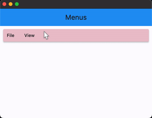
MenuBar with Nested Submenus#
import flet as ft


def main(page: ft.Page):
    appbar_text_ref = ft.Ref[ft.Text]()

    def handle_menu_item_click(e: ft.Event[ft.MenuItemButton]):
        text = e.control.content.value
        page.show_dialog(ft.SnackBar(ft.Text(f"{text} was clicked!")))
        appbar_text_ref.current.value = text
        page.update()

    def handle_submenu_open(e: ft.Event[ft.SubmenuButton]):
        print(f"{e.control.content.value}.on_open")

    def handle_submenu_close(e: ft.Event[ft.SubmenuButton]):
        print(f"{e.control.content.value}.on_close")

    def handle_submenu_hover(e: ft.Event[ft.SubmenuButton]):
        print(f"{e.control.content.value}.on_hover")

    page.appbar = ft.AppBar(
        title=ft.Text("Menus", ref=appbar_text_ref),
        center_title=True,
        bgcolor=ft.Colors.BLUE,
    )

    page.add(
        ft.Row(
            controls=[
                ft.MenuBar(
                    expand=True,
                    style=ft.MenuStyle(
                        alignment=ft.Alignment.TOP_LEFT,
                        bgcolor=ft.Colors.RED_300,
                        mouse_cursor={
                            ft.ControlState.HOVERED: ft.MouseCursor.WAIT,
                            ft.ControlState.DEFAULT: ft.MouseCursor.ZOOM_OUT,
                        },
                    ),
                    controls=[
                        ft.SubmenuButton(
                            content=ft.Text("File"),
                            on_open=handle_submenu_open,
                            on_close=handle_submenu_close,
                            on_hover=handle_submenu_hover,
                            controls=[
                                ft.MenuItemButton(
                                    content=ft.Text("About"),
                                    leading=ft.Icon(ft.Icons.INFO),
                                    on_click=handle_menu_item_click,
                                    style=ft.ButtonStyle(
                                        bgcolor={
                                            ft.ControlState.HOVERED: ft.Colors.GREEN_100
                                        }
                                    ),
                                ),
                                ft.MenuItemButton(
                                    content=ft.Text("Save"),
                                    leading=ft.Icon(ft.Icons.SAVE),
                                    on_click=handle_menu_item_click,
                                    style=ft.ButtonStyle(
                                        bgcolor={
                                            ft.ControlState.HOVERED: ft.Colors.GREEN_100
                                        }
                                    ),
                                ),
                                ft.MenuItemButton(
                                    content=ft.Text("Quit"),
                                    leading=ft.Icon(ft.Icons.CLOSE),
                                    on_click=handle_menu_item_click,
                                    style=ft.ButtonStyle(
                                        bgcolor={
                                            ft.ControlState.HOVERED: ft.Colors.GREEN_100
                                        }
                                    ),
                                ),
                            ],
                        ),
                        ft.SubmenuButton(
                            content=ft.Text("View"),
                            on_open=handle_submenu_open,
                            on_close=handle_submenu_close,
                            on_hover=handle_submenu_hover,
                            controls=[
                                ft.SubmenuButton(
                                    content=ft.Text("Zoom"),
                                    controls=[
                                        ft.MenuItemButton(
                                            content=ft.Text("Magnify"),
                                            leading=ft.Icon(ft.Icons.ZOOM_IN),
                                            close_on_click=False,
                                            on_click=handle_menu_item_click,
                                            style=ft.ButtonStyle(
                                                bgcolor={
                                                    ft.ControlState.HOVERED: ft.Colors.PURPLE_200
                                                }
                                            ),
                                        ),
                                        ft.MenuItemButton(
                                            content=ft.Text("Minify"),
                                            leading=ft.Icon(ft.Icons.ZOOM_OUT),
                                            close_on_click=False,
                                            on_click=handle_menu_item_click,
                                            style=ft.ButtonStyle(
                                                bgcolor={
                                                    ft.ControlState.HOVERED: ft.Colors.PURPLE_200
                                                }
                                            ),
                                        ),
                                    ],
                                )
                            ],
                        ),
                    ],
                )
            ]
        )
    )


ft.run(main)
Bases: Control
A menu bar that manages cascading child menus.
It could be placed anywhere but typically resides above the main body of the application and defines a menu system for invoking callbacks in response to user selection of a menu item.
clip_behavior: ClipBehavior = NONE
Whether to clip the content of this control or not.
col: ResponsiveNumber = 12
If a parent of this control is a [ResponsiveRow][flet.],
this property is used to determine
how many virtual columns of a screen this control will span.
Can be a number or a dictionary configured to have a different value for specific
breakpoints, for example col={"sm": 6}.
This control spans the 12 virtual columns by default.
Dimensions
| Breakpoint | Dimension |
|---|---|
| xs | <576px |
| sm | ≥576px |
| md | ≥768px |
| lg | ≥992px |
| xl | ≥1200px |
| xxl | ≥1400px |
The list of menu items that are the top level children of the MenuBar.
disabled: bool = False
Every control has disabled property which is False by default - control and all
its children are enabled.
Note
The value of this property will be propagated down to all children controls recursively.
Specifies whether/how this control should expand to fill available space in its parent layout.
More information here.
Note
Has effect only if the direct parent of this control is one of the following
controls, or their subclasses: [Column][flet.], [Row][flet.],
[View][flet.], [Page][flet.].
expand_loose: bool = False
Allows the control to expand along the main axis if space is available, but does not require it to fill all available space.
More information here.
Note
If expand_loose is True, it will have effect only if:
expandis notNoneand- the direct parent of this control is one of the following controls, or their
subclasses: [
Column][flet.], [Row][flet.], [View][flet.], [Page][flet.].
opacity: Number = 1.0
Defines the transparency of the control.
Value ranges from 0.0 (completely transparent) to 1.0 (completely opaque
without any transparency).
parent: BaseControl | None
The direct ancestor(parent) of this control.
It defaults to None and will only have a value when this control is mounted
(added to the page tree).
The Page control (which is the root of the tree) is an exception - it always
has parent=None.
tooltip: TooltipValue | None = None
The tooltip ot show when this control is hovered over.
visible: bool = True
Every control has visible property which is True by default - control is
rendered on the page. Setting visible to False completely prevents control (and
all its children if any) from rendering on a page canvas. Hidden controls cannot be
focused or selected with a keyboard or mouse and they do not emit any events.
Called once during control initialization to define its child controls. self.page is available in this method.