NavigationDrawer
Examples#
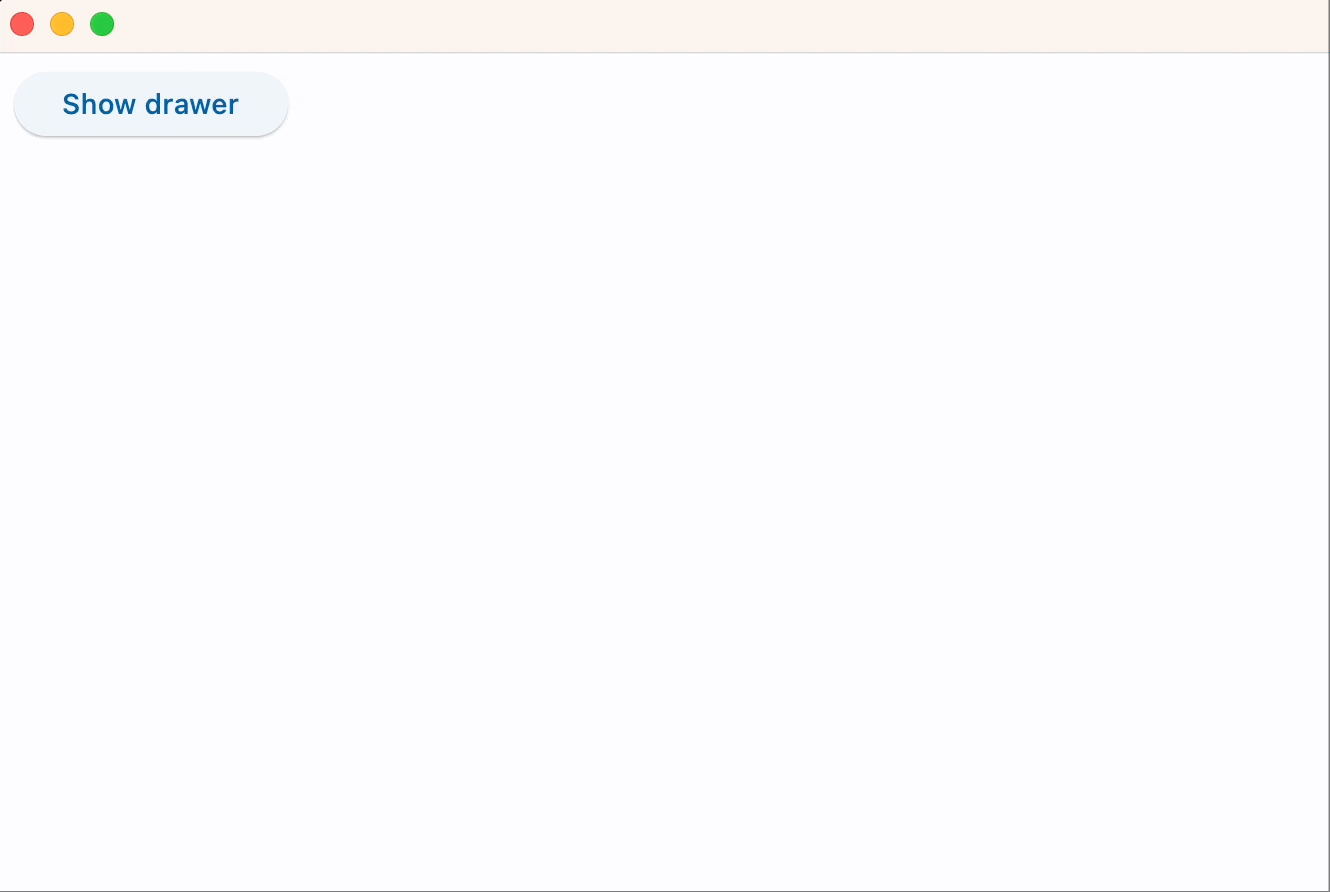
Start-aligned drawer#
import flet as ft


def main(page: ft.Page):
    def handle_dismissal(e: ft.Event[ft.NavigationDrawer]):
        print("Drawer dismissed!")

    def handle_change(e: ft.Event[ft.NavigationDrawer]):
        print(f"Selected Index changed: {e.control.selected_index}")
        page.pop_dialog()

    drawer = ft.NavigationDrawer(
        on_dismiss=handle_dismissal,
        on_change=handle_change,
        controls=[
            ft.Container(height=12),
            ft.NavigationDrawerDestination(
                label="Item 1",
                icon=ft.Icons.DOOR_BACK_DOOR_OUTLINED,
                selected_icon=ft.Icon(ft.Icons.DOOR_BACK_DOOR),
            ),
            ft.Divider(thickness=2),
            ft.NavigationDrawerDestination(
                icon=ft.Icon(ft.Icons.MAIL_OUTLINED),
                label="Item 2",
                selected_icon=ft.Icons.MAIL,
            ),
            ft.NavigationDrawerDestination(
                icon=ft.Icon(ft.Icons.PHONE_OUTLINED),
                label="Item 3",
                selected_icon=ft.Icons.PHONE,
            ),
        ],
    )

    page.add(
        ft.Button(
            content="Show drawer",
            on_click=lambda e: page.show_dialog(drawer),
        )
    )


ft.run(main)
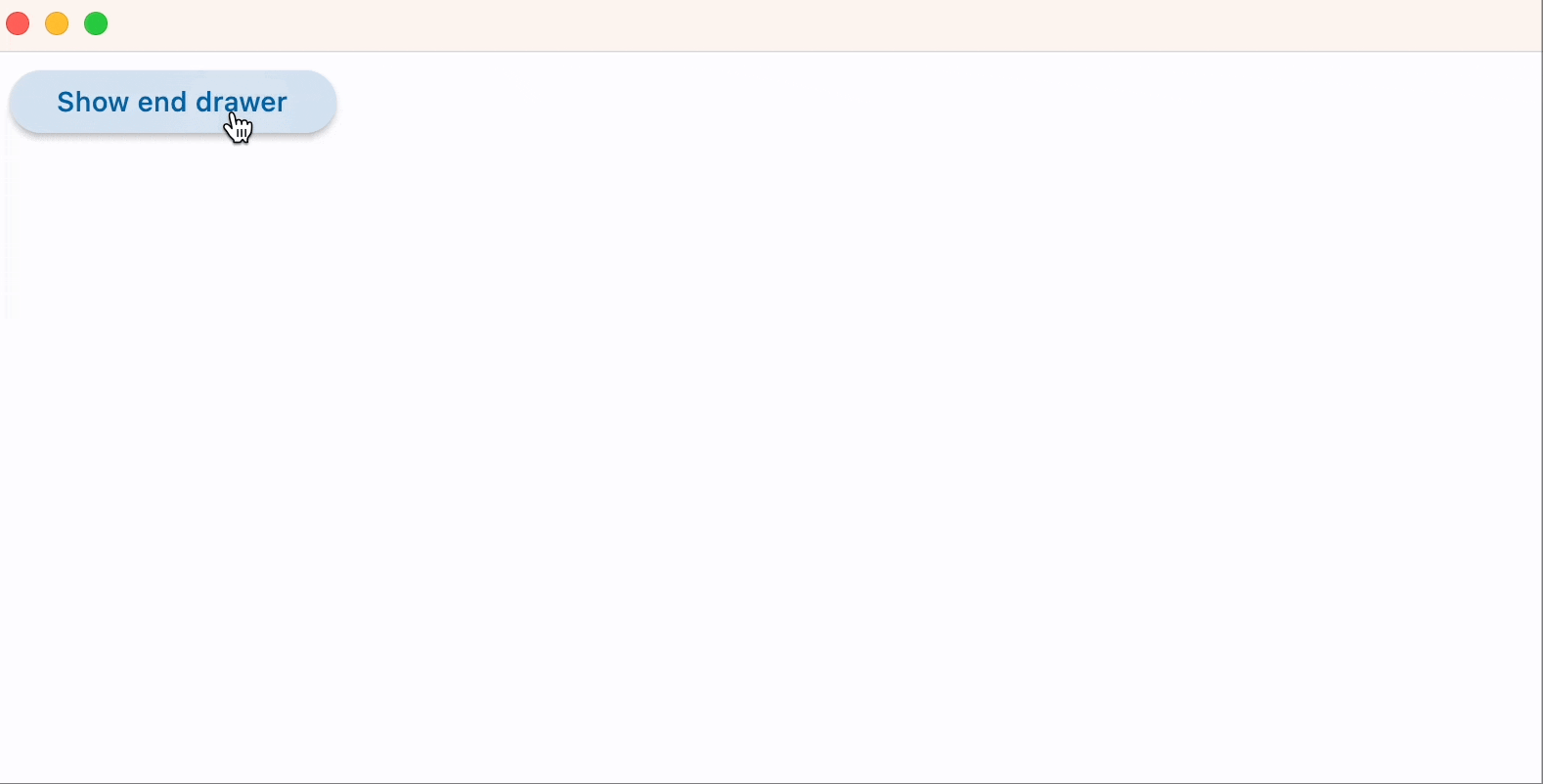
End-aligned drawer#
import flet as ft


def main(page: ft.Page):
    def handle_dismissal(e: ft.Event[ft.NavigationDrawer]):
        print("End drawer dismissed")

    def handle_change(e: ft.Event[ft.NavigationDrawer]):
        print(f"Selected Index changed: {e.control.selected_index}")
        page.pop_dialog()

    end_drawer = ft.NavigationDrawer(
        position=ft.NavigationDrawerPosition.END,
        on_dismiss=handle_dismissal,
        on_change=handle_change,
        controls=[
            ft.NavigationDrawerDestination(
                icon=ft.Icons.ADD_TO_HOME_SCREEN_SHARP,
                label="Item 1",
            ),
            ft.NavigationDrawerDestination(
                icon=ft.Icon(ft.Icons.ADD_COMMENT),
                label="Item 2",
            ),
        ],
    )

    page.add(
        ft.Button(
            content="Show end drawer",
            on_click=lambda e: page.show_dialog(end_drawer),
        )
    )


ft.run(main)
Bases: DialogControl
Material Design Navigation Drawer component.
Navigation Drawer is a panel slides in horizontally from the left or right edge of a page to show primary destinations in an app.
adaptive: bool | None = None
Enables platform-specific rendering or inheritance of adaptiveness from parent controls.
col: ResponsiveNumber = 12
If a parent of this control is a [ResponsiveRow][flet.],
this property is used to determine
how many virtual columns of a screen this control will span.
Can be a number or a dictionary configured to have a different value for specific
breakpoints, for example col={"sm": 6}.
This control spans the 12 virtual columns by default.
Dimensions
| Breakpoint | Dimension |
|---|---|
| xs | <576px |
| sm | ≥576px |
| md | ≥768px |
| lg | ≥992px |
| xl | ≥1200px |
| xxl | ≥1400px |
Defines the appearance of the items within the navigation drawer.
The list contains NavigationDrawerDestination items and/or other controls such as
headlines and dividers.
disabled: bool = False
Every control has disabled property which is False by default - control and all
its children are enabled.
Note
The value of this property will be propagated down to all children controls recursively.
Specifies whether/how this control should expand to fill available space in its parent layout.
More information here.
Note
Has effect only if the direct parent of this control is one of the following
controls, or their subclasses: [Column][flet.], [Row][flet.],
[View][flet.], [Page][flet.].
expand_loose: bool = False
Allows the control to expand along the main axis if space is available, but does not require it to fill all available space.
More information here.
Note
If expand_loose is True, it will have effect only if:
expandis notNoneand- the direct parent of this control is one of the following controls, or their
subclasses: [
Column][flet.], [Row][flet.], [View][flet.], [Page][flet.].
indicator_color: ColorValue | None = None
The color of the selected destination indicator.
indicator_shape: OutlinedBorder | None = None
The shape of the selected destination indicator.
on_change: ControlEventHandler[NavigationDrawer] | None = (
    None
)
Called when selected destination changed.
on_dismiss: ControlEventHandler[DialogControl] | None = None
Called when dialog is dismissed.
opacity: Number = 1.0
Defines the transparency of the control.
Value ranges from 0.0 (completely transparent) to 1.0 (completely opaque
without any transparency).
parent: BaseControl | None
The direct ancestor(parent) of this control.
It defaults to None and will only have a value when this control is mounted
(added to the page tree).
The Page control (which is the root of the tree) is an exception - it always
has parent=None.
selected_index: int = 0
The index for the current selected NavigationDrawerDestination or null if no
destination is selected.
A valid selected_index is an integer between 0 and number of destinations - 1. For
an invalid selected_index, for example, -1, all destinations will appear
unselected.
shadow_color: ColorValue | None = None
The color used for the drop shadow to
indicate elevation.
tile_padding: PaddingValue | None = None
Defines the padding for destination controls.
tooltip: TooltipValue | None = None
The tooltip ot show when this control is hovered over.
visible: bool = True
Every control has visible property which is True by default - control is
rendered on the page. Setting visible to False completely prevents control (and
all its children if any) from rendering on a page canvas. Hidden controls cannot be
focused or selected with a keyboard or mouse and they do not emit any events.
Called once during control initialization to define its child controls. self.page is available in this method.