Switch
Examples#
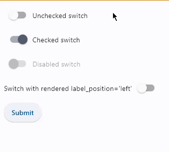
Basic Example#
import flet as ft


def main(page: ft.Page):
    def handle_button_click(e: ft.Event[ft.Button]):
        message.value = (
            f"Switch values are:  {c1.value}, {c2.value}, {c3.value}, {c4.value}."
        )
        page.update()

    page.add(
        c1 := ft.Switch(label="Unchecked switch", value=False),
        c2 := ft.Switch(label="Checked switch", value=True),
        c3 := ft.Switch(label="Disabled switch", disabled=True),
        c4 := ft.Switch(
            label="Switch with rendered label_position='left'",
            label_position=ft.LabelPosition.LEFT,
        ),
        ft.Button(content="Submit", on_click=handle_button_click),
        message := ft.Text(),
    )


ft.run(main)
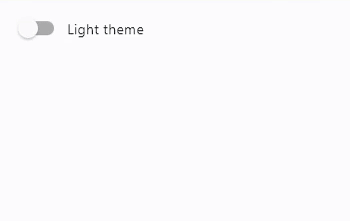
Handling change events#
import flet as ft


def main(page: ft.Page):
    def handle_switch_change(e: ft.Event[ft.Switch]):
        page.theme_mode = (
            ft.ThemeMode.DARK
            if page.theme_mode == ft.ThemeMode.LIGHT
            else ft.ThemeMode.LIGHT
        )
        e.control.label = (
            "Light ThemeMode"
            if page.theme_mode == ft.ThemeMode.LIGHT
            else "Dark ThemeMode"
        )
        page.update()

    page.theme_mode = ft.ThemeMode.LIGHT
    page.add(ft.Switch(label="Light ThemeMode", on_change=handle_switch_change))


ft.run(main)
Bases: LayoutControl, AdaptiveControl
A toggle represents a physical switch that allows someone to choose between two mutually exclusive options.
For example, "On/Off", "Show/Hide".
| RAISES | DESCRIPTION |
|---|---|
AssertionError
|
If |
active_track_color: ColorValue | None = None
The color to use on the track when this switch is on.
If track_color returns a non-none color in
the ControlState.SELECTED state, it will
be used instead of this color.
adaptive: bool | None = None
Whether an adaptive Switch should be created based on the target platform.
On iOS and macOS, a CupertinoSwitch is created,
which has matching functionality and presentation as Switch,
and the graphics as expected on iOS. On other platforms,
a Material Switch is created.
Defaults to False. See the example of usage
here.
animate_align: AnimationValue | None = None
Enables implicit animation of the [align][flet.LayoutControl.] property.
More information here.
animate_margin: AnimationValue | None = None
Enables implicit animation of the [margin][flet.LayoutControl.] property.
More information here.
animate_offset: AnimationValue | None = None
Enables implicit animation of the [offset][flet.LayoutControl.] property.
More information here.
animate_opacity: AnimationValue | None = None
Enables implicit animation of the [opacity][flet.LayoutControl.] property.
More information here.
animate_position: AnimationValue | None = None
Enables implicit animation of the positioning properties
([left][flet.LayoutControl.], [right][flet.LayoutControl.],
[top][flet.LayoutControl.] and [bottom][flet.LayoutControl.]).
More information here.
animate_rotation: AnimationValue | None = None
Enables implicit animation of the [rotate][flet.LayoutControl.] property.
More information here.
animate_scale: AnimationValue | None = None
Enables implicit animation of the [scale][flet.LayoutControl.] property.
More information here.
aspect_ratio: Number | None = None
The aspect ratio of the control. It is defined as the ratio of the width to the height.
autofocus: bool = False
Whether this switch will be selected as the initial focus. If there is more than one control on a page with autofocus set, then the first one added to the page will get focus.
bottom: Number | None = None
The distance that the child's bottom edge is inset from the bottom of the stack.
Note
Effective only if this control is a descendant of one of the following:
[Stack][flet.] control, [Page.overlay][flet.] list.
col: ResponsiveNumber = 12
If a parent of this control is a [ResponsiveRow][flet.],
this property is used to determine
how many virtual columns of a screen this control will span.
Can be a number or a dictionary configured to have a different value for specific
breakpoints, for example col={"sm": 6}.
This control spans the 12 virtual columns by default.
Dimensions
| Breakpoint | Dimension |
|---|---|
| xs | <576px |
| sm | ≥576px |
| md | ≥768px |
| lg | ≥992px |
| xl | ≥1200px |
| xxl | ≥1400px |
disabled: bool = False
Every control has disabled property which is False by default - control and all
its children are enabled.
Note
The value of this property will be propagated down to all children controls recursively.
Specifies whether/how this control should expand to fill available space in its parent layout.
More information here.
Note
Has effect only if the direct parent of this control is one of the following
controls, or their subclasses: [Column][flet.], [Row][flet.],
[View][flet.], [Page][flet.].
expand_loose: bool = False
Allows the control to expand along the main axis if space is available, but does not require it to fill all available space.
More information here.
Note
If expand_loose is True, it will have effect only if:
expandis notNoneand- the direct parent of this control is one of the following controls, or their
subclasses: [
Column][flet.], [Row][flet.], [View][flet.], [Page][flet.].
focus_color: ColorValue | None = None
The color to use for the focus highlight for keyboard interactions.
hover_color: ColorValue | None = None
The color to be used when it is being hovered over by the mouse pointer.
inactive_thumb_color: ColorValue | None = None
The color to use on the thumb when this switch is off.
Defaults to colors defined in the material design specification.
If thumb_color returns a non-none color
in the ControlState.DEFAULT state, it will be
used instead of this color.
inactive_track_color: ColorValue | None = None
The color to use on the track when this switch is off.
Defaults to colors defined in the material design specification.
If track_color returns a non-none color
in the ControlState.DEFAULT state, it will be
used instead of this color.
label: StrOrControl | None = None
The clickable label to display on the right of this switch.
label_text_style: TextStyle | None = None
The label's text style, when it is a string.
left: Number | None = None
The distance that the child's left edge is inset from the left of the stack.
Note
Effective only if this control is a descendant of one of the following:
[Stack][flet.] control, [Page.overlay][flet.] list.
mouse_cursor: MouseCursor | None = None
The cursor to be displayed when a mouse pointer enters or is hovering over this control.
offset: OffsetValue | None = None
Applies a translation transformation before painting the control.
The translation is expressed as an Offset scaled to the control's size.
So, Offset(x=0.25, y=0), for example, will result in a horizontal translation
of one quarter the width of this control.
Example
The following example displays container at 0, 0 top left corner of a stack as
transform applies -1 * 100, -1 * 100 (offset * control's size) horizontal and
vertical translations to the control:
on_animation_end: (
    ControlEventHandler[LayoutControl] | None
) = None
Called when animation completes.
Can be used to chain multiple animations.
The data property of the event handler argument contains the name
of the animation.
More information here.
on_blur: ControlEventHandler[Switch] | None = None
Called when the control has lost focus.
on_change: ControlEventHandler[Switch] | None = None
Called when the state of the Switch is changed.
on_focus: ControlEventHandler[Switch] | None = None
Called when the control has received focus.
opacity: Number = 1.0
Defines the transparency of the control.
Value ranges from 0.0 (completely transparent) to 1.0 (completely opaque
without any transparency).
overlay_color: ControlStateValue[ColorValue] | None = None
The color for the switch's
Material in various
ControlState states.
The following states are supported: ControlState.PRESSED,
ControlState.SELECTED, ControlState.HOVERED, ControlState.FOCUSED and
ControlState.DEFAULT.
padding: PaddingValue | None = None
The amount of space to surround the child inside the bounds of the Switch.
Defaults to horizontal padding of 4 pixels. If
Theme.use_material3 is false, then there is no
padding by default.
parent: BaseControl | None
The direct ancestor(parent) of this control.
It defaults to None and will only have a value when this control is mounted
(added to the page tree).
The Page control (which is the root of the tree) is an exception - it always
has parent=None.
right: Number | None = None
The distance that the child's right edge is inset from the right of the stack.
Note
Effective only if this control is a descendant of one of the following:
[Stack][flet.] control, [Page.overlay][flet.] list.
rotate: RotateValue | None = None
Transforms this control using a rotation around its center.
The value of rotate property could be one of the following types:
number- a rotation in clockwise radians. Full circle360°ismath.pi * 2radians,90°ispi / 2,45°ispi / 4, etc.Rotate- allows to specify rotationangleas well asalignment- the location of rotation center.
scale: ScaleValue | None = None
Scales this control along the 2D plane. Default scale factor is 1.0,
meaning no-scale.
Setting this property to 0.5, for example, makes this control twice smaller,
while 2.0 makes it twice larger.
Different scale multipliers can be specified for x and y axis, by setting
Control.scale property to an instance of Scale class.
Either scale or scale_x and scale_y could be specified, but not all of them.
splash_radius: Number | None = None
The radius of the splash effect when the switch is pressed.
thumb_color: ControlStateValue[ColorValue] | None = None
The color of this switch's thumb
in various ControlState
states.
The following states are supported: ControlState.SELECTED, ControlState.HOVERED,
ControlState.DISABLED, ControlState.FOCUSED and
ControlState.DEFAULT (fallback).
thumb_icon: ControlStateValue[IconData] | None = None
The icon of this Switch's thumb in various
ControlState states.
The following states are supported: ControlState.SELECTED, ControlState.HOVERED,
ControlState.DISABLED, ControlState.FOCUSED and
ControlState.DEFAULT (fallback).
tooltip: TooltipValue | None = None
The tooltip ot show when this control is hovered over.
top: Number | None = None
The distance that the child's top edge is inset from the top of the stack.
Note
Effective only if this control is a descendant of one of the following:
[Stack][flet.] control, [Page.overlay][flet.] list.
track_color: ControlStateValue[ColorValue] | None = None
The color of this switch's track
in various ControlState states.
The following states are supported: ControlState.SELECTED,
ControlState.HOVERED, ControlState.DISABLED, ControlState.FOCUSED and
ControlState.DEFAULT (fallback).
track_outline_color: (
    ControlStateValue[ColorValue] | None
) = None
The outline color of this switch's
track in various ControlState
states.
The following states are supported: ControlState.SELECTED, ControlState.HOVERED, ControlState.DISABLED, ControlState.FOCUSED and
ControlState.DEFAULT (fallback).
track_outline_width: (
    ControlStateValue[Number | None] | None
) = None
The outline width of this switch's track in all or specific
ControlState states.
The following states are supported: ControlState.SELECTED,
ControlState.HOVERED, ControlState.DISABLED,
ControlState.FOCUSED and ControlState.DEFAULT (fallback).
visible: bool = True
Every control has visible property which is True by default - control is
rendered on the page. Setting visible to False completely prevents control (and
all its children if any) from rendering on a page canvas. Hidden controls cannot be
focused or selected with a keyboard or mouse and they do not emit any events.
Called once during control initialization to define its child controls. self.page is available in this method.